My Tips and Tricks for Product Photography, Part 2
Welcome to the second part of My Tips and Tricks for Product Photography!
In the first part I discussed the photo setup that I have tinkered together. Now we are going to take a closer look at photo backgrounds and props, photo composition and angles and depth.
All these aspects play into one another and are undoubtedly intertwined.
Before starting to shoot photos of your creations, I think it would be wise to sit down and think about the style and feel of your products. Does your needlework have a romantic flair? Do your soaps emphasis the natural and earthy? Does your jewelry fall smack in the middle of steam punk?
In your photos it is important that the background does not clash with your product style. You want it to subtly support the feel your product gives off or supply a perfectly neutral background.
In my opinion, it is also unwise to put your item in front of such a strong or busy background that it goes under and becomes anything but the main focus of the photo.
In the following photo I have tried to do all the wrong things to show you what I mean.
My fused glass is contemporary and modern, so I use very neutral props like near white stones that I found on the beach or other backgrounds that have simple but flowing lines. Since my jewelry also makes a strong color statement and is at least partially transparent, I usually tend to choose white or near white backgrounds rather than dark ones.
For metal objects, for example, a dark background would provide a better contrast and makes the item stand out better. Or for a steam punk product, to choose another example, props with sharp corners and angles are probably a better choice than backgrounds with soft flowing lines.
My main point here is to really think about what compliments your product and don’t just go for the next best item that is in arm’s reach as a background.
Now let’s look at a few more things you can do to make your photos more than just informative for your buyers.
Photo composition is a very important tool that is at your disposal.
I encountered the rules for composition some time in school and university but I have to admit that I never consciously make my composition decisions based on any rules. I pretty much don’t remember them and I simply decide based on whether it looks good to me or not.
However, there are a gazillion articles on the web about the rules of composition in photography. And I do encourage you to read up on it but since I am not a photographer I would rather not regurgitate someone else’s knowledge here.
If you don’t feel like reading whole articles and you don’t feel like getting all into theory about it, let me stress the most important rule, in my book, in just a few words.
Don’t center your main focus (namely your item) in the photo!
Compare the following two very similar photos.


The photo of the centered donut looks a lot more static. Placing it slightly off-center adds direction and makes the photo look more interesting.
Obviously, there are always exceptions to the rules and you should follow your instinct when it tells you to break them. I do it all the time.
Now, let’s have a look at the difference angles can make.
I believe it is always a good idea to provide one perfect frontal view among the photos that you are allowed for each item listing. But I also believe that it would be a mistake to make this frontal view photo the first photo your potential buyers see.
The first visual encounter that people have with your product should be the hottest and most gorgeous photo you have and it doesn’t always have to even show the entire item. This is your chance to capture people’s attention and make them click further into your listing.
Consider the effect of the following angles.


I usually take a few shoots from each angle and then pick the one that speaks to me most as my first representative photo. There probably is some kind of theoretical rule and explanation to the effect of each angle, but honestly, I just let my gut decide.
However, I don’t think there has been even a single instant when the frontal view was the best looking angle. And when it comes to items made of glass, you can only really show transparencies and texture when you angle your photos.
The next and last aspect that I would like to discuss in this part of the series is depth.
It mostly applies when you have more than one item in your photo but depending on your background, you can create a sense of depths with that as well.
Compare the following two almost identical photos. I chose a very simple and plain view to try to not sidetrack the eye.


You can create foreground, middle ground, and background by placing several items at different distances from the camera and shooting the photo at a very shallow angle. You can force your camera to increase or decrease the resulting blur. I found a great article that explains it really well. You can check it out HERE.
There is also another way to create this depth blur. A lot of photo editing software programs have special functions to achieve this effect. But that will be part of the discussion in the third part of this series.
I hope this post was helpful and if you have any comments or suggestions, please feel free to share!
Shooting Photos Is Really Growing On Me
About a week ago, I ordered 2 silhouette mannequin necklace display stands. I figured, someone like me, making as many pendants / necklaces as I make, should really have a way to display them the way nature intended them.
So, they arrived today and I just had to take some photos with my new play things.
And here lays the difference now. I don’t need these photos for any listings. The pendants in them are not for sale. I just took them for the fun of it. If you would have told me 8 or 9 months ago, I would ever say or do that, I would have thought you are totally nuts. Photography was a chore. I hated it.
Anyway, I really like these two shoots. There is just so much that went right with them; the flowing lines of the display and the lines of the pendant, the soft shadows, the cool colors, the composition.
So, I’m just going to finish the post and continue to look at them, hehe. Me like!


Product Photography Gone Wild
Today, I am having a bit of a lazy kind of day. I just can’t come up with enough energy to do anything productive and the same goes for anything fun or entertaining.
I’m just sitting here on the couch with my laptop and I’m fiddling around with this and that while watching my husband play Fallout 3.
So I was looking through all the “discarded” product photos I still have and was contemplating deleting them all. But since I am in a fiddling kind of mood, I grabbed one and started tweaking it with my graphics program.
I am not the type of person to read instruction manuals. I learn by pushing buttons and seeing what happens. So that is what I did with the photo and it’s actually quiet amazing what can be done with something you consider garbage when you change the intent and purpose of it. And it’s even more amazing how much fun it can be.
So here is the original photo that wasn’t good enough to use as a product photo.

On a side note:
You can see some of my make shift photo setup here. In the upper right corner you can see the diffuser panel I use between the light sources and the object. They are called acrylic light diffuser panels for fluorescent lights and you can buy them at Home Depot. I clamp them with two steel spring clamps (like this one) and I am then able to simply stand the panels up on the hand part of the clamps.
I take most of my product photos on mirrors. It enables you to quickly and without a fuss change the background color by simply standing up a colored foam board behind the scene (as you can see in the upper left corner of the photo). You can get these boards in many colors at stores like Michaels. Also, the mirror diffuses the light further and reduces the amount of light you have to shine on the object to begin with.
In this photo I placed a textured clear sheet of glass on top of the mirror. This trick creates neat relection effects without eliminating the merits of the mirror and if you take the photos from an extreme angle, it almost makes it look wet.
OK, now that I have gotten all side-tracked, let’s get back to what I actually wanted to show you.
So, here is the first adjustment I made, which is simply cropping the photo to something that looks nice with an interesting composition. In my opinion, it always helps if you include parts that are out of focus that either lead towards the object in focus or away from it. In my case here, I had to place the unfocused part of the photo into the foreground because the background is taken up by undesirable elements that I needed to get out of the picture. So I ended up with quiet the extreme composition but I think that only makes it more interesting.

Next, I started playing with some of the effects my program has to offer. First I turned everything except for the rainbow in the pendant and the rainbow reflection on the glass into a black and white photo.

Then I applied some light burst effects to the chain and pendant. It looks like there is some kind of spell on it now =)

The next one has the weave effect applied. It’s not good to see the object very well but it does look rather funky.

And the last one is even more funky. This is the chrome effect of my program and it works really well on photos that have a lot of contrast to begin with.

There are many many more cool effect to play with but I would run out of available memory here.
I actually just wanted to show you the photos and now this has turned into some kind of how-to article.
Anyways, it’s just lots of fun to hit all the buttons and get entertained by the results. It might not sound like it, but it’s a form of learning.
GlassFancy

www.Glass-Fancy.com
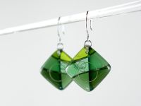
GlassFancy is all about fused glass jewelry. I work with non-dichroic art glass mostly made by the Bullseye glass company. You will find a large selection of pendants, some brooches and earrings at my online stores. I also make fused glass cabinet knobs & pulls. A colorful and up-beat accent for tired furniture!


Many of the pendants, brooches and earrings have 99.9% pure silver inclusions and all of the wire and bails I use are sterling silver.
Stay Connected